Interface
What is interface? Interface is a point where two systems, subjects, organization's, ect..., meet and interact. There are many different types of interface, ranging from computer's to cameras, printers, mobiles and many other electronic devices. The main interface people will be using is the one on your computer. Now a days everyone's desktop is different because there are so many different types and you will very rarely see two desktops which are completely identical. Here are a few examples of different interfaces you might see on your computer.
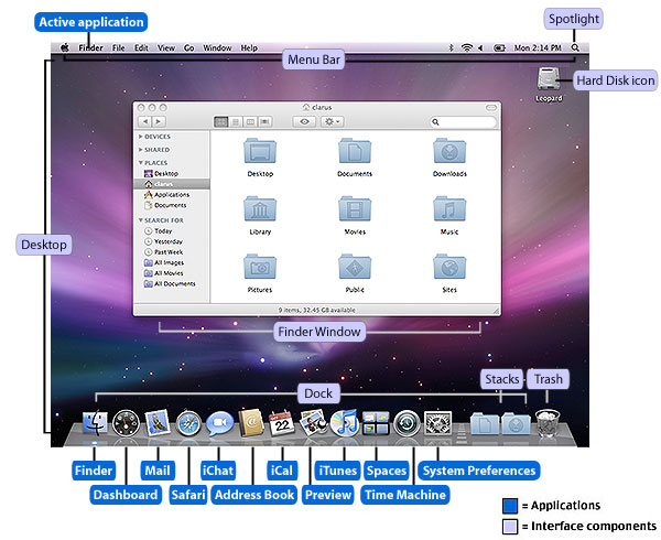
Mac
Window's XP

Windows 8

Something thats just as important as the computer is how your going to use the computer.
For example there are many ways of using a computer now a days. The main way to use a computer is mouse and keyboard. Here is an example of two mouse's which are very different but both very effective in both looks and usability.

The next mouse im going to talk about is the Razor Naga this is made by Razor and its a mouse used for gaming on a pc.

This mouse is again very different to the generic mouse. A lot like the magic mouse its editable maybe not to the same extent as the magic mouse. But its done in a very different way because its used for a different purpose. This mouse is a designed for gaming it has buttons all over it to enhance your gaming experience and make you play better.
It does this by allowing you the option to edit 16 buttons not including the left and right click and scroll wheel. It has 12 buttons on the left of the mouse which you can assign to do what you want. It also has 2 more side buttons on the right of the mouse and another 2 just left of the left click. All of these buttons are editable. This is useful for playing MMO's because you can create macros and assign them to each button. This is something you cant do on the magic mouse because it dosent have any buttons. On this mouse you can even assign more then one button to another button. For example you can click control > Z then assign it to 1 of your 16 buttons meaning when ever you click that button it will go back. This will save you from having to click both buttons at the same time. So its basically a short cut. Another thing you can do on this mouse that you cant do on many other mouses including the magic mouse is change the DPI. Which means dots per inch which is a measure of printing resolution.
Another hugh rivalry between product interface is the rivalry between Xbox 360 and PS3.
Here is a image of the PS3 dashboard to show what it looks like.

Its layout is very simple and easy to navigate. Along the X axis is shows all the categories
and along the Y axis it shows all the items with-in those categories. This makes is very easy and quick to find everything you need. It is very simple as well which makes it good for all ages and people wont get lost trying to find what they want.
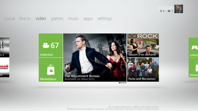
Here is a image of the xbox dashboard.

As you can see there very different. But again they have gone with a very simple approach. In my opinion this dashboard looks a lot better and has a much more stylish feel to it.
But for usability I think the PS3 is better. The PS3 is a lot more simple and you dont risk getting lost looking for something. I know after a while of using the Xbox360 dashboard you wont get lost but if your a first time user it can seem complicated. The xbox dashboard hasn't always looked like this and it has evolved a lot over time.

It started of with this dashboard and as you can see looks wise it isn't at all attractive to the eye. But with this dashboard I think the usability is just as good as the PS3 if not better. It works in pretty much the same format. Where categories work along the X axis and Y axis shows the items within the categories. But microsoft realised that looks are a bigger selling point then usability so they started to change there design.

After that they brought out another design. I feel this design is most like the PS3 dashboard because it is most like the PS3 dashboard. It works with the same X and Y axis. All they have done is change the appearance but it still works in the exact same way as the PS3 dashboard.

But this wasn't good enough. People were getting board of the same easy to use Y and X axis concept, just with a different look and feel to it. So microsoft completely changed there design and went for looks over usability. This is when they came up with there new design which we see today.
This design is so brilliant because its so different. It dosent just work with the Y and X axis, on this design you can navigate freely around to find what you want. Visually I feel it has a its very sleek and simple, It reminds me a lot of a mac product or design.
The main reason all of these interface's are so successful is because they all try to stick to the "Dont have to think" motto. Which basically means when ever your using the interface it should be just like second nature and you shouldn't have to think to use it. The idea is as soon as you start using it, you know what to do and It just feels natural.
Evaluation
For my sound toy I had the idea to create a cube that would randomly choose different sounds for you to listen to. This idea came from a website called Stumbleupon which is design to show of cool websites and increase your web knowledge. It does this by randomly searching for sites when you click the Stumbleupon button. My sound toy would work in the same way only with music instead of websites.
I have learnt the basic's of coding on unity and I have also learnt a lot about planning and design techniques like wire framing and paper prototypes.I also increased my presentation skills. But the main thing I learnt about was sound and the making of different sounds.
I think this unit is important because its skills could be used again in later life. For example the coding could be used for making games or websites, the planning and design techniques could be used for almost any projects. A long with the presentation skills.
The main thing that I think went wrong or wasn't successful is the final outcome which I used Unity to make. I think this the reason this didn't go well was because of Unity/ my knowledge of the program. I think having to learn a hole new program in such a short time was very ambitious.
I could fix these problems by spending less time on the design and idea, and spend more time on the coding and creating the final outcome.
No comments:
Post a Comment